CLICK HERE FOR BLOGGER TEMPLATES AND MYSPACE LAYOUTS »
Showing posts with label digital story telling. Show all posts

Monday, 15 March 2010

Step by Step


After photocopying my images and printing them using cellulose thinners I scanned the prints into Photoshop. I changed the levels to bring the differences in tone out more in the image. I then scanned in a piece of sugar paper and used the hue and saturation tool to change the colour, saturation and brightness. I then placed this in a layer underneath each of the prints in their separate Photoshop documents and then multiplying the prints to allow the texture to come through on the lighter parts of the image.  


I used Quick Time to save my .amr audio file in the.mp3 format so that I would be able to use it in Final cut pro. 

To import the audio tracks to the time line I set the in and out points in the viewer and then inserted the section. 

I adjusted the volumes of all the audio tracks so that the speech could be heard clearly along with the music. To do this I used the audio mixer tool. 


I added the cross dissolve video transition to the changes between pictures. This communicates the character fading away until he kills himself at the end. It generally adds to the lonely and sad feel of the piece as the transition is often used when showing pictured of people who have died. 


As I was creating the video I realised that some of the images were lasting too long to hold the viewers attention. To combat this I turned on the wire-frame in Final Cut Pro to allow me to change the size of the images. I then cut the length of the photo and made the second part zoom in to a smaller part of the image. This helps to keep the viewers attention through the piece. 


I used the tint filter and used key-frames to set the colour changes, and fade between these, to edit the images within Final Cut Pro. However I didn't like this effect. I felt that the video was more effect without the colour change, for communicating sadness and loneliness.

Evaluation

What were you asked to do?
Create a digital story based on monologues from a film, a poem, part of a script etc...
What did you make/present?
A photo montage film based on the character of Worsly in Caryl Churchill's Owners.
What did you want to communicate?
The character in the play is lonely, he makes many different failed attempts at suicide. I was not trying to take a literal re telling of the play but wanted to explore the loneliness of the character.
What materials and processes did you experiment with?
I used cellulose thinners to print my images. This gives a grainy effect, effective for communicating the loneliness and sadness within my piece. To do this I changed the levels of my photos in Photoshop to allow the differences in tones to come through more. I then printed and photocopied these before using the cellulose thinners to print. Once these were scanned in I changed the levels in Photoshop to bring the areas of tone out more. I then scanned in some sugar paper and multiplied the images on to this to give more of a feel of it being printed
I also experimented with getting the colour of the images to change, slowly fading between one another in the video. I used the tint effect in Final Cut to change the colour and key frames to create the fade between colours.
What materials and processes did you reject?
I rejected the colour changing of the images within the video. I didn't like the effect. I think that the video is more effective as it is. The feeling of loneliness and sadness was distracted from by the colour changing.
What did you do to ensure you worked with tools and materials safely?
Cellulose thinners were used outdoors to ensure good ventilation and care was taken not to spill any of the substance.
How well did you manage your time?
Apart from the fact that I had to compile my portfolio at the start of the project, putting my slightly behind  I think that I managed time fairly well during this project. everything was completed on time and there didn't seem to be any real rush to get it finished.
What were your strengths in completing this project?
I have used Final Cur Pro before and find that I Take to the program fairly easily. This meant that I didn't have to worry about controlling the program and could work on the creative side of the design.
What would you like to have done differently?
If I were to complete the project again I would like to get my own recording of some sad piano music. However due to time restraints I was unable to do this for the project.


This is La Jetee by Chris Marker, which uses the technique of photo montage to tell it's story.


I like the use of photo montage to tell the story, it takes the emphasis away from the action and places it on the narrative. It also allows the viewer to take in each image more thoroughly and pick up on the visual language being used in each shot to enhance the narrative. 


The panning and zooming techniques used with in the montage add movement and interest as do the transitions. The transitions within the montage help to create meaning for instance harsh cuts are used during dramatic events and soft dissolves are used when we are being shown the destruction of Paris - showing the way that the City has come to a stand still. 


I also like the use of sound and music within the piece. The music is used well to build tension as you follow it's flow. It build's up and then relaxes again as it follows the pace of the narrative. Whispering is the only sound used other then music and the narrator and shows the secrecy of the experiments they are doing and  the fact that what they are doing is dodgy. They need to whisper to cover up their act so others do not hear what they are doing. 

Monday, 18 January 2010

Evaluation - Mark

For this porject I decided to push myself to learn new software so that I could create a kinetic typography piece. I wanted to take the oportunity to widen my design scope and software knowledge. However I had to teach myself the software which has also caused problems. I managed to get on ok with the software, however time has been an issue as it has taken me longer to gain knowledge of how the software works as apposed to having someone teach it to me or using software I already know.
My strength in the project has been my ability to pick up software fairly quickly and my willingness to learn.
My weakness has probably been my story board. I gave tried to do it digitally this time however I am still not happy with the result.

For reasearch I have look at both still image and motion graphics designers to help provide me with ideas for the project. I wanted to give an aged look to my piece as I was doing the begining of the end of death, using a christian song and Bible quotes to show this. I wanted to communicate that the message was old but relevant. in research I found that artists had achieved this using sepeia tones to give an aged paper effect. I created this myself by tea staining paper.
Whilst looking at motion graphics designers I found that they used the animation or look of the words to represent their meaning. I have incorporated this into my work. For instance the words "in dark corners my name" have been made small to give a feeling of being in a tight, cramped corner.

If I were to do the project again I would want to master the use of the camera in Motion as I was unable to work out how to get it to work correctly for me. This would enhance the motion graphics piece that I did.
Next time I am going to use software that I already know as this will allow me to concentrate on the creative process and creating the design rather then having to put the time into learning new software, leaving me with less time to design.

Design Process - Mark


I created my background texture by using the scanned image of tea stained paper and crumpled paper. I multiplied the tea stained layer to allow the crumpled paper texture to come through to make it appear as crumpled tea stained paper.

I used iTunes to rip the track I was using from CD. I then converted this to .mp3 to work in motion. I edited the song down in Final Cut Pro as the controls for doing so are easier then in Motion. I then exported the new version as an .mp3, again so it would work in motion. I cut down the song as it is repetitive and has a long solo section. I used the crossfade option to blend the sections of the song together and make it sounds as if it had been one continuous piece of music.


I then opened up motion and typed the song lyrics in using the faith collapsing font.  Each of the words had to be on a separate layer for the animation. This gave greater control over the individual positioning and size of each word, as well as enabling the words to appear at different times.


I then sorted out the composition of my lyrics using my ideas and storyboard to create the compositions. This involved resizing and positioning the words.


I then used the time line and dragged the time that each word appeared to correspond with the lyrics. I used the inbuilt behaviours within motion to get the words to fade in and out. I then set the duration over which this would happen for instance 4 frames for the fade in/out.


I wanted to add a video texture to the word fire. To do this I selected the word and used the tyle tabe within the inspector. I selected fill with texture and then dragged the video that I had into the panel. This gave the word the texture that I wanted.


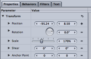
I wanted the word fall to literally fall. To do this I used keyframes for the start and end point for this, on the position in properties. I also used behaviors to make the word fade in.


I then exported the project as a .mov file as this is the standard file format to use ready for others to view.

Tuesday, 1 December 2009

Batteries not Included - Motion Graphics


I really like this visual representation of the phrase created in After Effects. This shows perfectly how typography can be used to communicate the meaning of words, which is something that I need to aim to achieve in my work. I will look at ways in which I can use the type to communicate the meaning of the words.

That's My King! Typography Film


That's My King! from Albert Martin on Vimeo.

I like the way that the maker of this film has included some other graphics and also some video into the piece. The way that the video pieces freeze and become stylised graphics looks really effective. The video over all is stylised to look like an old scroll, communicating the fact that it is talking about biblical subjects, I want to stylise my video in a similar way using the sepia like tones and black text and graphics as I am wanting to communicate a similar thing.

Tick Tick Boom Motion Graphics


The maker of this Typography Motion Graphics short film uses the movement of the text to represent it's sound. For instance it blurs and snaps to place, representing the loud, almost shouting way that the singer sings. The camera is also rotated at the end of some of the song lines, showing the distinction between the lines. In my piece I will want to find ways to represent both the sound of the song and the words being sung through my graphics.

The creator of this piece has probably used either After Effects of Motion to create this piece. The text will have been created in the program and key frames used to animate it. The camera has also been animated using key frames to create movement and rotation. The items and camera are moved in the canvas and then a key frame added to create movement, the tweening is done automatically in the programs.

Typography tutorials

http://ae.tutsplus.com/tutorials/motion-graphics/design-rhythmic-motion-typography-in-after-effects/

For my Digital Storytelling project I want to create typographical motion graphics short film. I found the tutorial above to help give me ideas. The movement in the graphics needs to represent some aspect of the sound or the story, for instance important words may be bigger and functional words (and, it etc) made smaller to represent their relative insignificance.

http://www.kenstone.net/fcp_homepage/motion_working_keyframes1_spencer.html
As after effects isn't available for me to use I have taught myself how to use Motion, part of the Final Cut Pro package. Although I have worked most things out how to create a key frame was not immediately apparent so I used the tutorial above to learn how to use them in the program.