My website has been hosted at the following address http://nwep.james-lock.co.uk/
Friday, 22 January 2010
Web design evaluation
For this project I had to create an online information system for an apocalypse scenario. I chose to use a nuclear attack as my scenario.
I decided that I wanted to mix flash and HTML to create my information system.
Due to time constraints I feel that I ended up rushing the creation of the flash and this has had an impact on the quality of the work. I feel that visually it doesn't work as well as I would have liked. The white backgrounds to the flash are too harsh against the dark template for HTML. I would also have like to have created mroe interactivity in a couple of the pages, however again I ran out of time to do this.
I wanted to keep my navigation clear and consistent throughout the site as this is easiest for the user, making their use of the site more enjoyable. It means that they are more likely to use the website for a longer time and also return to the website. If people get frustrated with navigation they are unlikely to want to use the website.
I feel that I have been successful in this aim as my navigation is consistent throughout the website, at the top right of the web page.
As part of the creation process I learned how to create my own scroll box using actions script and masks. I have also generally become more confident with flash. I do generally get the way in which Flash works and understand how the coding works
Next time I will plan my time more effectively to allow myself to complete the design to the best that I can rather then having to rush. Part of what caused this for me is that I had to design the HTML elements as well as the Flash.
Website Step-by-step.


The text had to me masked to get it to work in a scroll box.
This code was added to the actions layer:
function downward(){
if (txt._y>-32.8) [this bit stops the text from being able to scroll outside of the area which it is meant to]
txt._y=txt._y-2; [this controls the scroll and tells flash to more 2 pixels every time the button is pressed]
}
function upward(){
if (txt._y<27.2)
txt._y=txt._y+2;
}
function mover(myscroller){
goer=setInterval(myscroller,1000);
goer;
}
And this to the buttons for the scroll bar
on(press){
clearInterval(mover);
mover(upward);
}This makes the custom scroll bar work.
I made an invisible button using the rectangle tool and deleting the frames apart from on the hit state for the handle, to make the doors open. This code was used:
This gets flash to play frame two, which has no stop command, so flash plays to the end of the doors opening as that frame has a stop command.on(press){
gotoAndPlay(2);
}

To create the login page I used three keyframes. The first holds the password message and the text field for the password to be entered. The second frame displays the password fail message. And the third frame has the password protected information in it.
var myPassword:String= 'password' [this sets the password, in this case it is password]
submit_btn.onRelease=function(){
if (password_txt.text== myPassword ){
gotoAndStop(3); [if the password is correct this tells flash to go to and stop on frame 3]
}
else{
gotoAndStop(2); [if the password is incorrect flash will go and stop on frame 2]
}
}

To create my food page I use the alpha channel and motion tweens to get the page to fade in.
I wanted hot spots on the background image over the tin and the packets to make more text appear in the bottom text window. To do this I put text in a movie clip on frame two with a blank frame one. I then create invisible buttons over the tin and the packet and used the following code
packsbut.addEventListener(MouseEvent.MOUSE_OVER,packsplay); [the button will do something when the mouse hovers over it]
function packsplay(event:MouseEvent):void
{ packs.gotoAndStop(2); [the button will cause flash to got to and stop on frame two of the packs movie clip, this will show the text]
}
packsbut.addEventListener(MouseEvent.MOUSE_OUT,packsstop);
function packsstop(event:MouseEvent):void
{ packs.gotoAndStop(1); [when the mouse leaves the invisible button it will return the movie clip to frame one, making the text disappear again.]
}

To create the web pages I sliced my template in Photoshop. In Dreamweaver I then selected the table cell which covered the area I wanted to input the rest of my design and deleted it. I then used the image as the background to the cell so that I could enter information etc into it. I inserted my flash interface for each page in this cell. I also selected each of the slices that contained the links and linked these to the pages which they needed to link to. This was repeated for each of the pages I wanted to create.
Thursday, 21 January 2010
Great thinkers
Postmodernism:
a) All truth is limited, approximate, and is constantly evolving
b) No theory can ever be proved true (we can only show that a theory is false)
c) No theory can ever explain all things
d) Thus absolute and certain truth that explains all things is unobtainable.
"The ONLY ABSOLUTE TRUTH is that there are NO ABSOLUTE TRUTHS" (Feyerabend)
"Finally, if nothing can be truly asserted, even the following claim would be false,
the claim that there is no true assertion." (Aristotle)
"If anyone thinks nothing is to be known, he does not even know whether that can be known,
as he says he knows nothing." (Lucretius)
"And isn't it a bad thing to be deceived about the truth, and a good thing to know what the truth is?
For I assume that by knowing the truth you mean knowing things as they really are." (Plato)
Ludwig Wittgenstein 1889-1951
"Our investigation is a grammatical one. Such an investigation sheds light on our problem by clearing misunderstandings away. Misunderstandings concerning the use of words, caused, among other things, by certain analogies between the forms of expression in different regions of language."
“For a large class of cases–though not for all–in which we employ the word “meaning” it can be defined thus: the meaning of a word is its use in the language.”
Karl Marx
The gap between the rulling classes and the workers. Society needs to be restructured. Workers become the commodety themselves as well as what they are working on.
Lead to socialism.
Wednesday, 20 January 2010
Interactive interface design research.

The navigation on this website is large and clear, it is also the same on each page giving consistency to the website and making it easy to navigate around the website. The website is centered, possibly using CSS, this means that the look of the website is consistent in any size of browser. The home page isn't cluttered with too much information but is kept simple and clean making it pleasing to interact with. It also makes it look professional giving a good first impression of the company and its work.
The ideas that I want to include in my own design is a nice simple and clear navigation system that is consistent throughout my site. This will make it easy for my users to interact with and use my interface.

Moodle is an open source communication system mainly aimed at the educational environment. The design and composition is poor. The page is cluttered and finding where the information you want can be confusing. The package is designed to be simple and easy to use for staff who may not have much computing knowledge but the over simplification on this level leads to a poor file structure for end user.
I will put much more into the designing of my site, making it look attractive for users and also make sure that my pages are not cluttered and that navigation is not complex and confusing.


My main criticism of the website is the moving background, whilst this isn't distracting from the content and is a nice design feature it made me feel ill through motion sickness. I usually only experience this whilst reading in the car and is probably due to concentrating on something with other movement around. The designer should be more aware of how this could effect his users, I had to look away from the screen and take the screen grabs quickly to stop the motion sickness continuing. This would mean that visitors would leave the site.
The idea of using space within a design, stopping it from becoming cluttered is something that I will consider in my design. The small navigation and content works well.
Monday, 18 January 2010
Evaluation - Mark
For this porject I decided to push myself to learn new software so that I could create a kinetic typography piece. I wanted to take the oportunity to widen my design scope and software knowledge. However I had to teach myself the software which has also caused problems. I managed to get on ok with the software, however time has been an issue as it has taken me longer to gain knowledge of how the software works as apposed to having someone teach it to me or using software I already know.
My strength in the project has been my ability to pick up software fairly quickly and my willingness to learn.
My weakness has probably been my story board. I gave tried to do it digitally this time however I am still not happy with the result.
For reasearch I have look at both still image and motion graphics designers to help provide me with ideas for the project. I wanted to give an aged look to my piece as I was doing the begining of the end of death, using a christian song and Bible quotes to show this. I wanted to communicate that the message was old but relevant. in research I found that artists had achieved this using sepeia tones to give an aged paper effect. I created this myself by tea staining paper.
Whilst looking at motion graphics designers I found that they used the animation or look of the words to represent their meaning. I have incorporated this into my work. For instance the words "in dark corners my name" have been made small to give a feeling of being in a tight, cramped corner.
If I were to do the project again I would want to master the use of the camera in Motion as I was unable to work out how to get it to work correctly for me. This would enhance the motion graphics piece that I did.
Next time I am going to use software that I already know as this will allow me to concentrate on the creative process and creating the design rather then having to put the time into learning new software, leaving me with less time to design.
Design Process - Mark

I used iTunes to rip the track I was using from CD. I then converted this to .mp3 to work in motion. I edited the song down in Final Cut Pro as the controls for doing so are easier then in Motion. I then exported the new version as an .mp3, again so it would work in motion. I cut down the song as it is repetitive and has a long solo section. I used the crossfade option to blend the sections of the song together and make it sounds as if it had been one continuous piece of music.

I then opened up motion and typed the song lyrics in using the faith collapsing font. Each of the words had to be on a separate layer for the animation. This gave greater control over the individual positioning and size of each word, as well as enabling the words to appear at different times.

I then sorted out the composition of my lyrics using my ideas and storyboard to create the compositions. This involved resizing and positioning the words.

I then used the time line and dragged the time that each word appeared to correspond with the lyrics. I used the inbuilt behaviours within motion to get the words to fade in and out. I then set the duration over which this would happen for instance 4 frames for the fade in/out.

I wanted to add a video texture to the word fire. To do this I selected the word and used the tyle tabe within the inspector. I selected fill with texture and then dragged the video that I had into the panel. This gave the word the texture that I wanted.

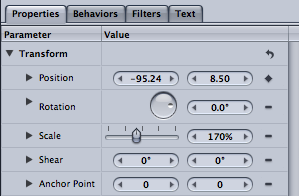
I wanted the word fall to literally fall. To do this I used keyframes for the start and end point for this, on the position in properties. I also used behaviors to make the word fade in.
I then exported the project as a .mov file as this is the standard file format to use ready for others to view.
Subscribe to:
Comments (Atom)

