You can now find me on Twitter @ http://www.twitter.com/james__lock
My personal blog is http://james-lock.tumblr.com
Monday, 18 October 2010
Wednesday, 21 April 2010
"When troubles tumble in on dismal days remember this: it's not the end of the world and if it was it would matter even less." twitturgies
Friday, 16 April 2010
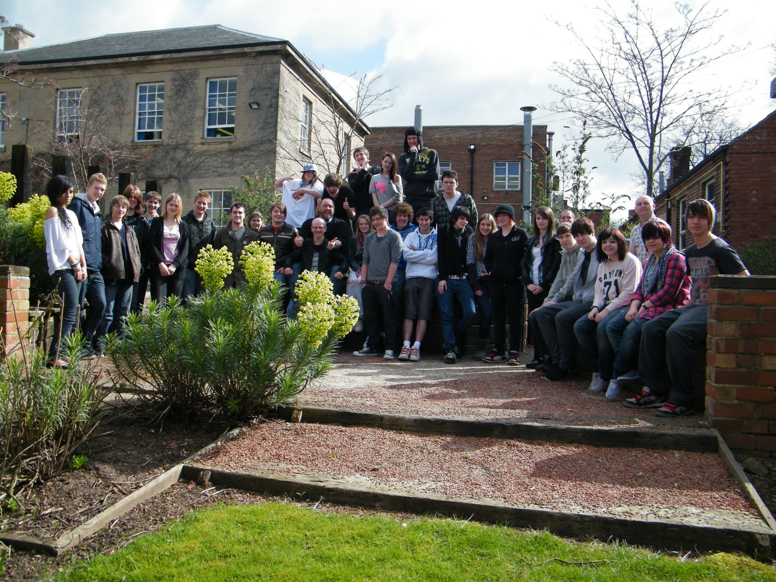
Class of 2009-10
For those who want the pic taken the day Mark left here it is, click on the pic to load a bigger version.
Friday, 2 April 2010
Updated: Misrepresented by a journalist for a Dutch Newspaper
Update:
I have been in contact with Sanne and it would appear that there is bit of a mis understanding her translation of what she writes is: ‘I’m worried about the violence,’ he writes. ‘And I think young people get a raw deal in the media. It often has to do with violence and stuff. That only gets people into a panic.’ which is a lot close to what I had originally written then the translations that I had before hand. She has also apologised for calling me a T-shirt Designer. I have apologised for getting the wrong end of the stick and I am glad that it has been sorted out, I am going to leave my original post below so that you can read the whole of what I had to say on the issue.
Yeah I know it sounds surreal, but that is actually the situation I have found myself in. Seriously, the things I get myself into. If you found my website through the blog post by Sanne Rooseboom - http://www.depers.nl/buitenland/468022/Bendeoorlog.html I would firstly like to point out that I am not a t-shirt designer, it isn't even a part of what I have done in the past, although it may well become part of what I do in the future, short and/or long term. Also below is my original comment on the situation to Sanne, I feel that my views haven't really been done justice and have perhaps been moulded to fit slightly more in with the views of the main stream media. Me views come from studying Sociology, which included a module on the media including how it reports on and affects minority groups and research that I did for my knife crime project last year.
Below is the original message that I sent to Sanne:
Why are you active against knife crime?:
The Nottinghamshire area where I live in the UK is one of the worst for knife crime. The police and Crimestoppers asked our college to get design students to produce a range of posters for them. Also the view that people have of young people is an important issue close to my heart, I feel that we get a raw deal from the media. It was a project that I was passionate about, I think that as a designer feeling that you are helping to make a difference in a real way is great and will always be the best projects that you get.
Do you think the problem is getting less or worse?
Information that I found when researching the project suggests that knife crime as a problem is not getting worse in itself, but the demography of those committing offences is changing. The statistics have slowly changed to show more young people rather then adults committing offences. The media and government have both released data over the last couple of years to show that there has been growth in recent years and data to show that the problem is being reversed recently. The old adage "statistics, statistics, statistics" comes into play and I think it is possible to read what you want into it. There is certainly a feeling among the public that it is getting worse and has been turned into a moral panic, however I feel that a lot of this is down to the media and the way the issue is presented rather then first hand knowledge and hard facts about the issue. However not living within a city I may have a different perspective on the issue to those that do as gang culture is not such a big issue (especially as I live out of town as well).
What about awareness among young people?
This is increasing with campaigns being run, and education being given around the issue however it is a drip drip process. Again it isn't such a big issue because of my location. However I think there is a fairly wide awareness due to the media attention given to the issue. I do however feel that the media attention often only perpetuates the situation, it also only acts to create a moral panic.
After using a translator this is how the part of the blog that mentions me comes across: Through an anti-knife crime Facebook Site I in the mail with James, a boy from Nottinghamshire who designs T-shirts against knife violence. "I am worried about the violence," he writes. "And also about how young people in the media emerge. Usually associated with violence and shit. If you hunt people just fear. "So he designs T-shirts. Because there was no place for him in my article, at this link.
I'm sure some of it is down to translation errors but even so I don't think it represents my views.
Monday, 15 March 2010
Step by Step

After photocopying my images and printing them using cellulose thinners I scanned the prints into Photoshop. I changed the levels to bring the differences in tone out more in the image. I then scanned in a piece of sugar paper and used the hue and saturation tool to change the colour, saturation and brightness. I then placed this in a layer underneath each of the prints in their separate Photoshop documents and then multiplying the prints to allow the texture to come through on the lighter parts of the image.
I used Quick Time to save my .amr audio file in the.mp3 format so that I would be able to use it in Final cut pro.

To import the audio tracks to the time line I set the in and out points in the viewer and then inserted the section.

I adjusted the volumes of all the audio tracks so that the speech could be heard clearly along with the music. To do this I used the audio mixer tool.

I added the cross dissolve video transition to the changes between pictures. This communicates the character fading away until he kills himself at the end. It generally adds to the lonely and sad feel of the piece as the transition is often used when showing pictured of people who have died.

As I was creating the video I realised that some of the images were lasting too long to hold the viewers attention. To combat this I turned on the wire-frame in Final Cut Pro to allow me to change the size of the images. I then cut the length of the photo and made the second part zoom in to a smaller part of the image. This helps to keep the viewers attention through the piece.

I used the tint filter and used key-frames to set the colour changes, and fade between these, to edit the images within Final Cut Pro. However I didn't like this effect. I felt that the video was more effect without the colour change, for communicating sadness and loneliness.
Evaluation
What were you asked to do?
Create a digital story based on monologues from a film, a poem, part of a script etc...
What did you make/present?
A photo montage film based on the character of Worsly in Caryl Churchill's Owners.
What did you want to communicate?
The character in the play is lonely, he makes many different failed attempts at suicide. I was not trying to take a literal re telling of the play but wanted to explore the loneliness of the character.
What materials and processes did you experiment with?
I used cellulose thinners to print my images. This gives a grainy effect, effective for communicating the loneliness and sadness within my piece. To do this I changed the levels of my photos in Photoshop to allow the differences in tones to come through more. I then printed and photocopied these before using the cellulose thinners to print. Once these were scanned in I changed the levels in Photoshop to bring the areas of tone out more. I then scanned in some sugar paper and multiplied the images on to this to give more of a feel of it being printed
I also experimented with getting the colour of the images to change, slowly fading between one another in the video. I used the tint effect in Final Cut to change the colour and key frames to create the fade between colours.
What materials and processes did you reject?
I rejected the colour changing of the images within the video. I didn't like the effect. I think that the video is more effective as it is. The feeling of loneliness and sadness was distracted from by the colour changing.
What did you do to ensure you worked with tools and materials safely?
Cellulose thinners were used outdoors to ensure good ventilation and care was taken not to spill any of the substance.
How well did you manage your time?
Apart from the fact that I had to compile my portfolio at the start of the project, putting my slightly behind I think that I managed time fairly well during this project. everything was completed on time and there didn't seem to be any real rush to get it finished.
What were your strengths in completing this project?
I have used Final Cur Pro before and find that I Take to the program fairly easily. This meant that I didn't have to worry about controlling the program and could work on the creative side of the design.
What would you like to have done differently?
If I were to complete the project again I would like to get my own recording of some sad piano music. However due to time restraints I was unable to do this for the project.
This is La Jetee by Chris Marker, which uses the technique of photo montage to tell it's story.
I like the use of photo montage to tell the story, it takes the emphasis away from the action and places it on the narrative. It also allows the viewer to take in each image more thoroughly and pick up on the visual language being used in each shot to enhance the narrative.
The panning and zooming techniques used with in the montage add movement and interest as do the transitions. The transitions within the montage help to create meaning for instance harsh cuts are used during dramatic events and soft dissolves are used when we are being shown the destruction of Paris - showing the way that the City has come to a stand still.
I also like the use of sound and music within the piece. The music is used well to build tension as you follow it's flow. It build's up and then relaxes again as it follows the pace of the narrative. Whispering is the only sound used other then music and the narrator and shows the secrecy of the experiments they are doing and the fact that what they are doing is dodgy. They need to whisper to cover up their act so others do not hear what they are doing.
Friday, 26 February 2010
Evaluation
I started by researching other animations and how they had been produces. I like the animations using other day objects and people to animate with, so I decided to animate myself.
I found an animation of barcodes, which made me think of the theory that barcodes are actually the mark of the beast. So I researched more into that theory. It worked well with the theme of "The Beginning of the End of the Word". The song I chose was "My Given Life" by Mammuth, with the lyrics "trying to find the motivation, to live my given life" links in with trying to not succumb to the order that the Beast imposes with the Mark.
I conducted some animation tests, looking at how I could get the barcodes to appear in my eyes and how I could get my eyes to animate.
After I had completed my tests and edited my music to the section I wanted to use I animated and then edited the final footage.
If I were to do the project again I would hope to get my idea quicker. I had to put quite a bit of time into idea generation.
I quite like the idea that I came up with for the animation, I feel that it explores the idea in an abstract way, allowing the audience to think about and question the theme that I was referring to.
I feel that the biggest threat to the project for myself was the tutor being off ill, resulting in a lack of input from a specialist animation professional.
The opportunity presented to my in this project was being able to explore ways of animating with a different medium, the human body and learn more about experimental animation techniques.
I would also like to light my animation better if I were to do it again, to give a better visual quality to the final.
Animation tests
Test 2:
This is a test for my animating with bar codes. I had wanted to animate myself so that I boil slightly and have an animated quality to the visuals however when automating cutting out the eyes in Photoshop the head doesn't stay still enough so I have decided to use a still frame within the animation. I used the fish eye effect in FinalCut pro to make the car codes look more like eye balls.
Test 1:
I am going to make sure that my eyes open fully in my final. This is just for a short section of the animation. I will also make sure that I am wearing a white t-shirt and have a white background when I produce the final animation to make it look professional.
Monday, 25 January 2010
Friday, 22 January 2010
Web design evaluation
For this project I had to create an online information system for an apocalypse scenario. I chose to use a nuclear attack as my scenario.
I decided that I wanted to mix flash and HTML to create my information system.
Due to time constraints I feel that I ended up rushing the creation of the flash and this has had an impact on the quality of the work. I feel that visually it doesn't work as well as I would have liked. The white backgrounds to the flash are too harsh against the dark template for HTML. I would also have like to have created mroe interactivity in a couple of the pages, however again I ran out of time to do this.
I wanted to keep my navigation clear and consistent throughout the site as this is easiest for the user, making their use of the site more enjoyable. It means that they are more likely to use the website for a longer time and also return to the website. If people get frustrated with navigation they are unlikely to want to use the website.
I feel that I have been successful in this aim as my navigation is consistent throughout the website, at the top right of the web page.
As part of the creation process I learned how to create my own scroll box using actions script and masks. I have also generally become more confident with flash. I do generally get the way in which Flash works and understand how the coding works
Next time I will plan my time more effectively to allow myself to complete the design to the best that I can rather then having to rush. Part of what caused this for me is that I had to design the HTML elements as well as the Flash.
Website Step-by-step.


The text had to me masked to get it to work in a scroll box.
This code was added to the actions layer:
function downward(){
if (txt._y>-32.8) [this bit stops the text from being able to scroll outside of the area which it is meant to]
txt._y=txt._y-2; [this controls the scroll and tells flash to more 2 pixels every time the button is pressed]
}
function upward(){
if (txt._y<27.2)
txt._y=txt._y+2;
}
function mover(myscroller){
goer=setInterval(myscroller,1000);
goer;
}
And this to the buttons for the scroll bar
on(press){
clearInterval(mover);
mover(upward);
}This makes the custom scroll bar work.
I made an invisible button using the rectangle tool and deleting the frames apart from on the hit state for the handle, to make the doors open. This code was used:
This gets flash to play frame two, which has no stop command, so flash plays to the end of the doors opening as that frame has a stop command.on(press){
gotoAndPlay(2);
}

To create the login page I used three keyframes. The first holds the password message and the text field for the password to be entered. The second frame displays the password fail message. And the third frame has the password protected information in it.
var myPassword:String= 'password' [this sets the password, in this case it is password]
submit_btn.onRelease=function(){
if (password_txt.text== myPassword ){
gotoAndStop(3); [if the password is correct this tells flash to go to and stop on frame 3]
}
else{
gotoAndStop(2); [if the password is incorrect flash will go and stop on frame 2]
}
}

To create my food page I use the alpha channel and motion tweens to get the page to fade in.
I wanted hot spots on the background image over the tin and the packets to make more text appear in the bottom text window. To do this I put text in a movie clip on frame two with a blank frame one. I then create invisible buttons over the tin and the packet and used the following code
packsbut.addEventListener(MouseEvent.MOUSE_OVER,packsplay); [the button will do something when the mouse hovers over it]
function packsplay(event:MouseEvent):void
{ packs.gotoAndStop(2); [the button will cause flash to got to and stop on frame two of the packs movie clip, this will show the text]
}
packsbut.addEventListener(MouseEvent.MOUSE_OUT,packsstop);
function packsstop(event:MouseEvent):void
{ packs.gotoAndStop(1); [when the mouse leaves the invisible button it will return the movie clip to frame one, making the text disappear again.]
}

To create the web pages I sliced my template in Photoshop. In Dreamweaver I then selected the table cell which covered the area I wanted to input the rest of my design and deleted it. I then used the image as the background to the cell so that I could enter information etc into it. I inserted my flash interface for each page in this cell. I also selected each of the slices that contained the links and linked these to the pages which they needed to link to. This was repeated for each of the pages I wanted to create.
Thursday, 21 January 2010
Great thinkers
Postmodernism:
a) All truth is limited, approximate, and is constantly evolving
b) No theory can ever be proved true (we can only show that a theory is false)
c) No theory can ever explain all things
d) Thus absolute and certain truth that explains all things is unobtainable.
"The ONLY ABSOLUTE TRUTH is that there are NO ABSOLUTE TRUTHS" (Feyerabend)
"Finally, if nothing can be truly asserted, even the following claim would be false,
the claim that there is no true assertion." (Aristotle)
"If anyone thinks nothing is to be known, he does not even know whether that can be known,
as he says he knows nothing." (Lucretius)
"And isn't it a bad thing to be deceived about the truth, and a good thing to know what the truth is?
For I assume that by knowing the truth you mean knowing things as they really are." (Plato)
Ludwig Wittgenstein 1889-1951
"Our investigation is a grammatical one. Such an investigation sheds light on our problem by clearing misunderstandings away. Misunderstandings concerning the use of words, caused, among other things, by certain analogies between the forms of expression in different regions of language."
“For a large class of cases–though not for all–in which we employ the word “meaning” it can be defined thus: the meaning of a word is its use in the language.”
Karl Marx
The gap between the rulling classes and the workers. Society needs to be restructured. Workers become the commodety themselves as well as what they are working on.
Lead to socialism.
Wednesday, 20 January 2010
Interactive interface design research.

The navigation on this website is large and clear, it is also the same on each page giving consistency to the website and making it easy to navigate around the website. The website is centered, possibly using CSS, this means that the look of the website is consistent in any size of browser. The home page isn't cluttered with too much information but is kept simple and clean making it pleasing to interact with. It also makes it look professional giving a good first impression of the company and its work.
The ideas that I want to include in my own design is a nice simple and clear navigation system that is consistent throughout my site. This will make it easy for my users to interact with and use my interface.

Moodle is an open source communication system mainly aimed at the educational environment. The design and composition is poor. The page is cluttered and finding where the information you want can be confusing. The package is designed to be simple and easy to use for staff who may not have much computing knowledge but the over simplification on this level leads to a poor file structure for end user.
I will put much more into the designing of my site, making it look attractive for users and also make sure that my pages are not cluttered and that navigation is not complex and confusing.


My main criticism of the website is the moving background, whilst this isn't distracting from the content and is a nice design feature it made me feel ill through motion sickness. I usually only experience this whilst reading in the car and is probably due to concentrating on something with other movement around. The designer should be more aware of how this could effect his users, I had to look away from the screen and take the screen grabs quickly to stop the motion sickness continuing. This would mean that visitors would leave the site.
The idea of using space within a design, stopping it from becoming cluttered is something that I will consider in my design. The small navigation and content works well.
Monday, 18 January 2010
Evaluation - Mark
For this porject I decided to push myself to learn new software so that I could create a kinetic typography piece. I wanted to take the oportunity to widen my design scope and software knowledge. However I had to teach myself the software which has also caused problems. I managed to get on ok with the software, however time has been an issue as it has taken me longer to gain knowledge of how the software works as apposed to having someone teach it to me or using software I already know.
My strength in the project has been my ability to pick up software fairly quickly and my willingness to learn.
My weakness has probably been my story board. I gave tried to do it digitally this time however I am still not happy with the result.
For reasearch I have look at both still image and motion graphics designers to help provide me with ideas for the project. I wanted to give an aged look to my piece as I was doing the begining of the end of death, using a christian song and Bible quotes to show this. I wanted to communicate that the message was old but relevant. in research I found that artists had achieved this using sepeia tones to give an aged paper effect. I created this myself by tea staining paper.
Whilst looking at motion graphics designers I found that they used the animation or look of the words to represent their meaning. I have incorporated this into my work. For instance the words "in dark corners my name" have been made small to give a feeling of being in a tight, cramped corner.
If I were to do the project again I would want to master the use of the camera in Motion as I was unable to work out how to get it to work correctly for me. This would enhance the motion graphics piece that I did.
Next time I am going to use software that I already know as this will allow me to concentrate on the creative process and creating the design rather then having to put the time into learning new software, leaving me with less time to design.
Design Process - Mark

I used iTunes to rip the track I was using from CD. I then converted this to .mp3 to work in motion. I edited the song down in Final Cut Pro as the controls for doing so are easier then in Motion. I then exported the new version as an .mp3, again so it would work in motion. I cut down the song as it is repetitive and has a long solo section. I used the crossfade option to blend the sections of the song together and make it sounds as if it had been one continuous piece of music.

I then opened up motion and typed the song lyrics in using the faith collapsing font. Each of the words had to be on a separate layer for the animation. This gave greater control over the individual positioning and size of each word, as well as enabling the words to appear at different times.

I then sorted out the composition of my lyrics using my ideas and storyboard to create the compositions. This involved resizing and positioning the words.

I then used the time line and dragged the time that each word appeared to correspond with the lyrics. I used the inbuilt behaviours within motion to get the words to fade in and out. I then set the duration over which this would happen for instance 4 frames for the fade in/out.

I wanted to add a video texture to the word fire. To do this I selected the word and used the tyle tabe within the inspector. I selected fill with texture and then dragged the video that I had into the panel. This gave the word the texture that I wanted.

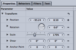
I wanted the word fall to literally fall. To do this I used keyframes for the start and end point for this, on the position in properties. I also used behaviors to make the word fade in.
I then exported the project as a .mov file as this is the standard file format to use ready for others to view.
Subscribe to:
Posts (Atom)

