CLICK HERE FOR BLOGGER TEMPLATES AND MYSPACE LAYOUTS »

Friday 18 September 2009

Slicing


Although I have done some web design in the past no one has shown me how to slice. I'm please to say it's actually pretty easy! Here is the tutorial I followed:

Create guideline where you want the slices to be.


Use the slices tool to convert guides to slices. Then combine the slices that you want to merge. Then save for web.


Ta-da finished website in Safari :).

Web design research

This year I am doing web design as a module at college. The first brief is to create a personal portfolio site (...finally I can upload something that will impress universities, designers, agencies etc rather then on that just serves it's purpose!)

I am starting my research into what makes a good design.

The first website that I looked at is http://vermeersch.ca/


The website is based around a 1:1 ratio picture of the artist. You navigate around the website using the buttons at the bottom, which then make you travel around his body to find out different navigation. The website is simple and easy to navigate as the navigation is always visible as the bottom of the screen. It is clean and easy to take in and navigate around. The idea is strong, the artist says that he puts a lot of himself into his work which is why he has created the site as he has, creating a strong idea for the basis of the website.
There is also an explore option in the navigation bar that allows you to look around the site freely.


The portfolio section of the website is displayed in this box, with its own navigation for the projects. Each link causes the box to move to a different part of his body - so that you explore the whole of his body. As you hover over it the information about the project is displayed at the bottom of the box.

Overall the website is simple to navigate, clean, clear and serves it's purpose.
The limitations of the site is that it could easily become cluttered if more content needed to be added. Also it is slow to load on slower connections, over my broad band wi fi at home it took considerably longer then on the wired network at college. However the target audience for the website are more likely to be people working in offices with faster internet connections on wired networks, making the loading faster. The final limitation is that some of the links to his work are now dead, this looks unprofessional and is something that I would need to keep on top of on my website if I was linking to externally hosted projects.

Representing myself with my website is something that I should consider with my website, to show universities and potential clients who I am. Also a simple navigation system is useful for users of a website, meaning that they would be more likely to want to use the website.

I have also looked at http://positivehype.com/


I really like the design of this site, the bright colours on the dark background. I would really like to create something like that. I think that it shows my personality, with my friendly, bubbly side in juxtaposition with my like of darker films, stories, myths, imagery etc.
This front page is clean, simple and easy to navigate. Everything fits in the browser screen, meaning that you ca take everything in easily.

On their "our work" and "blog" pages the navigation bar disappears which is annoying as you have to go back to the original site to be able to navigate to other pages.  This is poor design, the navigation should provide a continuation between pages for consistency and also ease. I fell that people are going to find this frustrating and are less likely to want to use the website. I will need to make sure that my navigation is easy to use and consistent for my website users.

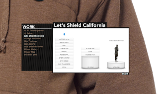
http://equation.laptop.org/


This is the website for a charity that believes that a lot of the worlds problems are down to education, and that the solution is for every child to have a laptop to support their education. This is a simple campaign website asking for people to become part of the equation for change. You can add yourself to the chain, selecting your colour, name and equation that you would like to add. The scrolling is simple, just move the mouse left or right and the chain scrolls through, it also animates up and down as a chain and plays a musical note.
You can then click on one of the icons to load up a box with information in. I really like this idea, it is something that I would like to use for my portfolio, however I am not sure if it would be practical. For one it would be hard for people to tell what is going to load what in my portfolio (although perhaps I could get around this with different icons for web design, illustration etc and captions explaining what they are). It is also hard to accurately click on the different icons to load the information you want. This could be helped with larger icons and slower scrolling.

http://www.dinghyinsurance.com/


The web design for this site is awful, to the point where I am struggling to find anything nice to say about it. And I have no idea where to start criticising, so I will just go for it. Firstly the links are the same colour as the background colour, this makes them hard to read, and would be impossible for people some people to read. The website is not very accessible. Secondly a lot of the text is underlined, meaning that it is easily confused as being a hyper-link. This is annoying when you go to click on this text. The three images, which I can only assume, should be in line with one another are not. They also cause conflict for the eye as they are all brightly, coloured competing for your attention. The colour also clashes with the rest of the website. No consideration has been given to composition.
Basically the only thing that I can take from this to make my design better is to avoid all of the mistakes made by the designer(s).

http://www.karimzariffa.com/

I really like this website, which centres around a simple, clean menu bar which floats in the centre of the screen. The layout is clean and easy to take in, the large text is easy to read.


As you click on each of the menu items they unfold upwards until you are focused on the top box. From there you can click on the lower box to scroll down, or in the grey area to zoom back out to use the menu bar again.


I feel that the simple, clean design really works. The website is easy to navigate and find your way around. Using one page helps people to be away of the orientation of different items.
For my design I could look at a simplified, clean navigation system to make it easy for a viewer to look around.

http://www.havenworks.com/


This website is awful. The designer as clearly put very little thought into the design. This is shown in a few ways. Firstly the website doesn't fit on the screen horizontally (and I am using the standared 1280 by 800 resolution) and vertically you need to scroll a long way. Secondly there is far to much information on the page. The eye is unable to take it all in and the information gets lost on the page. I don't think a visitor to the website would know where to start with taking in the information, and you are likely to miss the information you are looking for. Poor layout adds to this with far to many columns on the page. Too many colours have been used, including colours that clash. Again this makes it hard to find and take in the information on the page, as it causes a conflict for the eye.

Thursday 17 September 2009

Lightwave

I have had my first 3D modeling & animation lesson today. We need to research, develop and create our own world of the future using the Lightwave software. I have come up with an initial idea which is actually drawn from an activity I did in a science lesson about 5 years ago in Year 9. We had to create a way for humans to live on another planet as the world was being destroyed. My idea was to build a large dome on the moon and use large air tanks to supply the air until a self sustaining environment was created, through the growth of plants. I am using this as my starting point and initial idea and developing it further from there.

Here is my first design sheet, it isn't very big because the college scanners are not working so I have had to take a picture on my phone (5MP so decent size) but then send it to Wordpress (as blogger doesn't have a UK mobile utility) and then save it to upload it. My life story over, that's why it is only a small image.

I have started to look at a couple of different ideas for developing the design.

I am quite excited about this project. I am now off to do more research!

Wednesday 16 September 2009

Brecht Follow Up

This is part of a documentary, you can see clips from his plays - as directed by him and see some of the techniques "in action" also his wife and others that worked with him and in his theatre. Talking about the man and his techniques etc


This is from Antigone as adapted by Brecht (originally by Sophocles). It isn't in English but is a good example of getus and I think know being able to understand what is being said helps this to become more apparent.

Brechtian Acting

In the past I have studied Drama GCSE and Drama & Theatre Studies A.S. Level. My favourite practitioner (and the one that was favoured by the college I went to) is Brecht. I will do a brief back story.


Drama had been about being as realistic as possible, making people believe in what was happening on stage, letting them get lost in the story and not challenging them at all. People went to the theatre to enjoy themselves, it was reserved for the bourgeoisie (the ruling class). 


Brecht wanted to change that. He believed that theatre should be for everybody. He also believed that theatre should be used to challenge people, to question their morality, to highlight political issues, injustice and other wrong doings. He also broke down the fourth wall (the invisible one between the audience and the actors on stage, separating the audience from the action and them being involved). He believed that people should be aware that they are watching a play at all times, and not drawn in to the story and believing it was a state of reality, allowing them to remain objective and pick up on the plays message.


Several techniques were used by him, by others following his style now and have also been developed (with new technology etc) by those trying to direct/act in the Brechtian style. Firstly Set and costume is kept to a minimum, perhaps just changing one item to denote the character being played (actors may also play more then one character - reminding the audience they are actors), set again may be denoted by just a couple of items, or a backdrop (and in recent times a computer projected image). Actors may change on stage from one character to the next - showing that they are actors and not the people they are playing once again. The language used is colloquial and easily understood by the lower classes, the price is also affordable - famously with the Threepenny Opera (which cost a Threepenny to see). When it is thought the audience is perhaps likely to start becoming emotionally involved in the play, through sympathy with a certain character etc a song is often used to break this, allowing the audience to remain objective. 


The Verfremdungseffekt (or V-effekt) is used to describe the action being made strange, alien, detached to stop the audience from identifying with a character, to allow them clarity of thought. The characters in his plays were meant to represent a type of person, rather then an individual character. Questioning the roles of different types of people within society, Archetypes are often used to represent these. Also the person acting should not try to become the character but rather portray them i.e. they are not trying to get into the mind set of the character, as with other styles of acting but rather show what has been said, done etc. It is more of a narrative of the character then an impersonation. Getus - over acting, large actions are used by actors, again this show that they are not trying to impersonate a character, it also adds to the archetypes - over acting of typical mannerisms etc may be used. 


He also believed that only bright lighting (which source could clearly be seen my the audience) should be used, as lighting to create mood would be too suggestive to an audience. His plays always had a political or social motive to their meaning questioning the roles and actions of the ruling class and their dominance over the rest of society. He points out injustice, fraud and other wrong doings. Sadly his plays are as relevant today as they were when written (as I found out when doing the Threepenny Opera, a closing dialogue was written summarising the points of the play using examples from the news of the previous 12 months)


There is much more I could talk about, it is almost endless. However I feel I have outlined some of the main points. I love the style and also really like the fact that there is always a political point attached to his plays. In some ways I feel he was the equivalent of the Dada movement in theatre. 


I am going to look at ways to include some Brechtian style techniques in my visual work. Apparently it may be more relevant for the next college brief, however I wanted to write down my thoughts now as they came to me. 


I got the information for this from past experience and also here

Joggler Ad


This is the recent 02 Joggler Ad on TV. I love the cut out effect of the characters in it and the different textures etc used on them to build up the character (like wrapping paper, wool etc) making them look like a child has made them - the kind of thing that would be found on the fridge door. I like the style generally and I am thinking about possibly building it into my animation although the idea would need more development. I also like the lighting in this advert - the way that it creates defined shadows behind the characters, giving more of a 3D feel to the advert.

As a sideline I also think that the picture frame TV screens that o2 have in their stores at the minute are awesome. They look really cool and make great interior design. With the right decoration it would look really good in a living room. I'll try find a picture to upload.

Monday 14 September 2009

La Jetee


This is La Jetee by Chris Marker, which uses the technique of photo montage to tell it's story. The college brief I have been given today is to create my own photo montage telling a story from my life. 


So I thought a good place to start would be evaluating this video - something that I will come back to and add to as I go along. 


I like the use of photo montage to tell the story, it takes the emphasis away from the action and places it on the narrative. It also allows the viewer to take in each image more thoroughly and pick up on the visual language being used in each shot to enhance the narrative. 


The panning and zooming techniques used with in the montage add movement and interest as do the transitions. The transitions within the montage help to create meaning for instance harsh cuts are used during dramatic events and soft dissolves are used when we are being shown the destruction of Paris - showing the way that the City has come to a stand still. 


I also like the use of sound and music within the piece. The music is used well to build tension as you follow it's flow. It build's up and then relaxes again as it follows the pace of the narrative. Whispering is the only sound used other then music and the narrator and shows the secrecy of the experiments they are doing and  the fact that what they are doing is dodgy. They need to whisper to cover up their act so others do not hear what they are doing. 


So these are my observations so far I will add more as I have more to say :)