This is the animatic and final animation for the Light animation. This shows how the animatic represents what is happening in the final but is not a finished and polished piece and has less movement in it. This is done as it is cost effective. These examples also show how an animation changes, more animatics would be produced to show these changes as they are requested by whoever is commissioning the animation, until a final animatic is agreed on to take to animation for final. Again this cuts the cost of producing final animation when changes may be made, it saves time as well as money.
Wednesday, 7 October 2009
Light
Posted by jay at 14:43 0 comments
Gorillaz Animatic
http://www.youtube.com/watch?v=xJmCWeyRlpo
Unfortunately the embed utility is disabled for the above video. However it is an animatic for the Gorillaz song Dare. This shows how an animatic is used to pitch an animation, without going to the cost of producing the animation before it possibly being turned down - which would be a loss. The animatic is simple but shows more movement then a story board, it is also set to the sound track used for the animation. This gives the viewer an idea of what the animation will look and move like. This animatic also introduces some colour, showing the night club like lights again giving the feel of the animation to the viewer. Animatics are supposed to be fairly cheap to produce as the animation is not necessarily going to be commissioned at this stage and fully animating would cost too much for the risk of a loss.
Posted by jay at 14:17 0 comments
Labels: animatic, animation, dare, gorillaz, Sound, story board, viewer
Tuesday, 22 September 2009
Honda Diesel Ad
Posted by jay at 21:47 0 comments
Labels: advert, colour, colourful, diesel, grr, honda, Personality
Jamie Dean
The items used within the film also add to the old look of it. I really like the simple animation and the jerking movement of the obejects. This reminds me of old childens stop motions such as Camberwick Green and Trumpton and could be recreated through playing with the frame rates and/or shooting fewer frames.
The animator has used focus settings to create parts of the animation that started out of focus and then focuses in. I like this effect, it is surreal and really adds to the effect of the film.
The music really adds to the effect of the dark feel of the film, the spacing between the bass and the treble within the song and the contrast within this. The slow, lingering tempo of the song adds to the creepy effect as well.
The overall feel of the short film is Gothic and Surreal. I really like this. Again it shows the side of my personality that really likes creepy, strange things.
Posted by jay at 21:27 0 comments
Labels: animation, camberwick green, gothic, jamie dean, super 8, surreal, trumpton
Erica Russel
Posted by jay at 20:48 0 comments
Nightmare Before Christmas
Stop motion puppets have been used to create this animation. Lip syncing is created using different puppet heads, which are replaced to create the mouth shapes of the vocal sounds. Many of these have to be used for each sound to create realistic, smooth motion between the vocal sounds. The puppets joints will have hinges or ball joins which you are able to move but are stiff enough to stay in place so that each small movement for every frame can be captured to create the smooth movement of the puppets.
Posted by jay at 19:56 0 comments
Labels: Dark, double exposure, Nightmare Before Christmas, Personality, puppet, Tim Burton
Friday, 18 September 2009
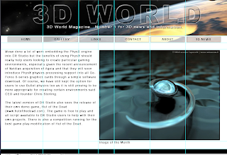
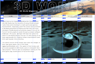
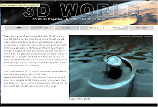
Slicing
Posted by jay at 12:27 0 comments
Web design research
This year I am doing web design as a module at college. The first brief is to create a personal portfolio site (...finally I can upload something that will impress universities, designers, agencies etc rather then on that just serves it's purpose!)
I am starting my research into what makes a good design.
The first website that I looked at is http://vermeersch.ca/
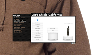
Representing myself with my website is something that I should consider with my website, to show universities and potential clients who I am. Also a simple navigation system is useful for users of a website, meaning that they would be more likely to want to use the website.
http://equation.laptop.org/
This is the website for a charity that believes that a lot of the worlds problems are down to education, and that the solution is for every child to have a laptop to support their education. This is a simple campaign website asking for people to become part of the equation for change. You can add yourself to the chain, selecting your colour, name and equation that you would like to add. The scrolling is simple, just move the mouse left or right and the chain scrolls through, it also animates up and down as a chain and plays a musical note.
You can then click on one of the icons to load up a box with information in. I really like this idea, it is something that I would like to use for my portfolio, however I am not sure if it would be practical. For one it would be hard for people to tell what is going to load what in my portfolio (although perhaps I could get around this with different icons for web design, illustration etc and captions explaining what they are). It is also hard to accurately click on the different icons to load the information you want. This could be helped with larger icons and slower scrolling.
http://www.dinghyinsurance.com/
http://www.karimzariffa.com/
I really like this website, which centres around a simple, clean menu bar which floats in the centre of the screen. The layout is clean and easy to take in, the large text is easy to read.
I feel that the simple, clean design really works. The website is easy to navigate and find your way around. Using one page helps people to be away of the orientation of different items.
For my design I could look at a simplified, clean navigation system to make it easy for a viewer to look around.
http://www.havenworks.com/
This website is awful. The designer as clearly put very little thought into the design. This is shown in a few ways. Firstly the website doesn't fit on the screen horizontally (and I am using the standared 1280 by 800 resolution) and vertically you need to scroll a long way. Secondly there is far to much information on the page. The eye is unable to take it all in and the information gets lost on the page. I don't think a visitor to the website would know where to start with taking in the information, and you are likely to miss the information you are looking for. Poor layout adds to this with far to many columns on the page. Too many colours have been used, including colours that clash. Again this makes it hard to find and take in the information on the page, as it causes a conflict for the eye.
Posted by jay at 10:45 0 comments
Labels: artist, personal, portfolio, web design, webdesign
Thursday, 17 September 2009
Lightwave
I have had my first 3D modeling & animation lesson today. We need to research, develop and create our own world of the future using the Lightwave software. I have come up with an initial idea which is actually drawn from an activity I did in a science lesson about 5 years ago in Year 9. We had to create a way for humans to live on another planet as the world was being destroyed. My idea was to build a large dome on the moon and use large air tanks to supply the air until a self sustaining environment was created, through the growth of plants. I am using this as my starting point and initial idea and developing it further from there.
Here is my first design sheet, it isn't very big because the college scanners are not working so I have had to take a picture on my phone (5MP so decent size) but then send it to Wordpress (as blogger doesn't have a UK mobile utility) and then save it to upload it. My life story over, that's why it is only a small image.
I have started to look at a couple of different ideas for developing the design.
Wednesday, 16 September 2009
Brecht Follow Up
This is part of a documentary, you can see clips from his plays - as directed by him and see some of the techniques "in action" also his wife and others that worked with him and in his theatre. Talking about the man and his techniques etc
This is from Antigone as adapted by Brecht (originally by Sophocles). It isn't in English but is a good example of getus and I think know being able to understand what is being said helps this to become more apparent.
Posted by jay at 21:27 0 comments
Labels: Antigone, brecht, documentary, drama, Getus, play, theatre


