This year I am doing web design as a module at college. The first brief is to create a personal portfolio site (...finally I can upload something that will impress universities, designers, agencies etc rather then on that just serves it's purpose!)
I am starting my research into what makes a good design.
The first website that I looked at is http://vermeersch.ca/
The website is based around a 1:1 ratio picture of the artist. You navigate around the website using the buttons at the bottom, which then make you travel around his body to find out different navigation. The website is simple and easy to navigate as the navigation is always visible as the bottom of the screen. It is clean and easy to take in and navigate around. The idea is strong, the artist says that he puts a lot of himself into his work which is why he has created the site as he has, creating a strong idea for the basis of the website.
There is also an explore option in the navigation bar that allows you to look around the site freely.

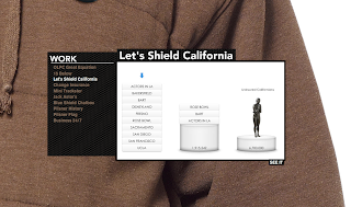
The portfolio section of the website is displayed in this box, with its own navigation for the projects. Each link causes the box to move to a different part of his body - so that you explore the whole of his body. As you hover over it the information about the project is displayed at the bottom of the box.
Overall the website is simple to navigate, clean, clear and serves it's purpose.
The limitations of the site is that it could easily become cluttered if more content needed to be added. Also it is slow to load on slower connections, over my broad band wi fi at home it took considerably longer then on the wired network at college. However the target audience for the website are more likely to be people working in offices with faster internet connections on wired networks, making the loading faster. The final limitation is that some of the links to his work are now dead, this looks unprofessional and is something that I would need to keep on top of on my website if I was linking to externally hosted projects.
Representing myself with my website is something that I should consider with my website, to show universities and potential clients who I am. Also a simple navigation system is useful for users of a website, meaning that they would be more likely to want to use the website.
Representing myself with my website is something that I should consider with my website, to show universities and potential clients who I am. Also a simple navigation system is useful for users of a website, meaning that they would be more likely to want to use the website.
I have also looked at http://positivehype.com/
I really like the design of this site, the bright colours on the dark background. I would really like to create something like that. I think that it shows my personality, with my friendly, bubbly side in juxtaposition with my like of darker films, stories, myths, imagery etc.
This front page is clean, simple and easy to navigate. Everything fits in the browser screen, meaning that you ca take everything in easily.
On their "our work" and "blog" pages the navigation bar disappears which is annoying as you have to go back to the original site to be able to navigate to other pages. This is poor design, the navigation should provide a continuation between pages for consistency and also ease. I fell that people are going to find this frustrating and are less likely to want to use the website. I will need to make sure that my navigation is easy to use and consistent for my website users.
http://equation.laptop.org/
This is the website for a charity that believes that a lot of the worlds problems are down to education, and that the solution is for every child to have a laptop to support their education. This is a simple campaign website asking for people to become part of the equation for change. You can add yourself to the chain, selecting your colour, name and equation that you would like to add. The scrolling is simple, just move the mouse left or right and the chain scrolls through, it also animates up and down as a chain and plays a musical note.
You can then click on one of the icons to load up a box with information in. I really like this idea, it is something that I would like to use for my portfolio, however I am not sure if it would be practical. For one it would be hard for people to tell what is going to load what in my portfolio (although perhaps I could get around this with different icons for web design, illustration etc and captions explaining what they are). It is also hard to accurately click on the different icons to load the information you want. This could be helped with larger icons and slower scrolling.
http://www.dinghyinsurance.com/
http://www.karimzariffa.com/
I really like this website, which centres around a simple, clean menu bar which floats in the centre of the screen. The layout is clean and easy to take in, the large text is easy to read.
As you click on each of the menu items they unfold upwards until you are focused on the top box. From there you can click on the lower box to scroll down, or in the grey area to zoom back out to use the menu bar again.
I feel that the simple, clean design really works. The website is easy to navigate and find your way around. Using one page helps people to be away of the orientation of different items.
For my design I could look at a simplified, clean navigation system to make it easy for a viewer to look around.
http://www.havenworks.com/
This website is awful. The designer as clearly put very little thought into the design. This is shown in a few ways. Firstly the website doesn't fit on the screen horizontally (and I am using the standared 1280 by 800 resolution) and vertically you need to scroll a long way. Secondly there is far to much information on the page. The eye is unable to take it all in and the information gets lost on the page. I don't think a visitor to the website would know where to start with taking in the information, and you are likely to miss the information you are looking for. Poor layout adds to this with far to many columns on the page. Too many colours have been used, including colours that clash. Again this makes it hard to find and take in the information on the page, as it causes a conflict for the eye.
http://equation.laptop.org/
This is the website for a charity that believes that a lot of the worlds problems are down to education, and that the solution is for every child to have a laptop to support their education. This is a simple campaign website asking for people to become part of the equation for change. You can add yourself to the chain, selecting your colour, name and equation that you would like to add. The scrolling is simple, just move the mouse left or right and the chain scrolls through, it also animates up and down as a chain and plays a musical note.
You can then click on one of the icons to load up a box with information in. I really like this idea, it is something that I would like to use for my portfolio, however I am not sure if it would be practical. For one it would be hard for people to tell what is going to load what in my portfolio (although perhaps I could get around this with different icons for web design, illustration etc and captions explaining what they are). It is also hard to accurately click on the different icons to load the information you want. This could be helped with larger icons and slower scrolling.
http://www.dinghyinsurance.com/
The web design for this site is awful, to the point where I am struggling to find anything nice to say about it. And I have no idea where to start criticising, so I will just go for it. Firstly the links are the same colour as the background colour, this makes them hard to read, and would be impossible for people some people to read. The website is not very accessible. Secondly a lot of the text is underlined, meaning that it is easily confused as being a hyper-link. This is annoying when you go to click on this text. The three images, which I can only assume, should be in line with one another are not. They also cause conflict for the eye as they are all brightly, coloured competing for your attention. The colour also clashes with the rest of the website. No consideration has been given to composition.
Basically the only thing that I can take from this to make my design better is to avoid all of the mistakes made by the designer(s).
http://www.karimzariffa.com/
I really like this website, which centres around a simple, clean menu bar which floats in the centre of the screen. The layout is clean and easy to take in, the large text is easy to read.
I feel that the simple, clean design really works. The website is easy to navigate and find your way around. Using one page helps people to be away of the orientation of different items.
For my design I could look at a simplified, clean navigation system to make it easy for a viewer to look around.
http://www.havenworks.com/
This website is awful. The designer as clearly put very little thought into the design. This is shown in a few ways. Firstly the website doesn't fit on the screen horizontally (and I am using the standared 1280 by 800 resolution) and vertically you need to scroll a long way. Secondly there is far to much information on the page. The eye is unable to take it all in and the information gets lost on the page. I don't think a visitor to the website would know where to start with taking in the information, and you are likely to miss the information you are looking for. Poor layout adds to this with far to many columns on the page. Too many colours have been used, including colours that clash. Again this makes it hard to find and take in the information on the page, as it causes a conflict for the eye.


0 comments:
Post a Comment