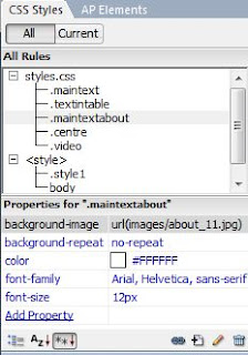
After creating the CSS styles I clicked on the cell and set the style in the properties panel. I also used CSS to set my font and font colour. I chose Arial as it is simple and professional it is also easy to read for users of the website. It has also been used in my work and so represents this.
I then set up the navigation. I clicked on the slice that I wanted to link and used the property panel to set the link.
I wanted the link to my blog to open in a new window, so that users won't have to leave the website to view it, meaning they are more likely to continue using the website after going to look at the blog.
I created a new table in the cell containing my background so that I was able to type my text above the place holder. I aligned this central to get my text to sit nicely in the place holder.
To centre the whole page I set up a new CSS rule as follows. I had to try several different combinations of percentages before I was happy with the result. I used the properties panel to set the page's table to use the CSS rule. I also set the main page background to black so that there is a solid background that fills all sizes of browser windows, this is more professional. I used CSS to do this as I was able to set the rule in a separate CSS document that I could set to be used in all my pages to save me having to set the centre coding for each individual page.
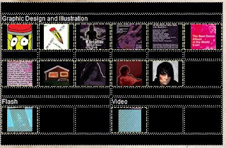
To create my "work" - portfolio page I inserted a table with one column and 7 rows. I then merged cells where necessary and typed the category titles. I then inserted the thumbnails I had created in Photoshop for the pieces of work that I want on my website. I then linked the image based pieces of works to the file containing the larger - full version of the piece of work.
I want the full versions of my work to open within my webpage rather then on a new webpage. This is more professional and integrated. It is easier for the user as they don't have to either leave the page or end up with extra windows to close back down again. To achieve this I downloaded the files for the lightbox javascript application. I had used this in the past and knew it was capable of what I wanted to achieve. I put the relevant files and directories in the directory for my website.
The following script is added in the tag of the HTML document to link the javascript and CSS files to it.
I then edited the code for each of my linked images as follows:
I have used the category [illustration] so that I can add other catagories to my work in the future but retain separate lightbox operations for them. I have also titled each of the images to give the user more information about it in lightbox.
I made the page for my VJ piece video. I used the same background as the other pages for this, but exported it as a single image and used it as the page background file. I had uploaded my video to Youtube and used the embedding code from there to input it into a table on the document. I again used CSS to position this. This allowed me to get the content to sit centered on the page, which looks more professional and generally makes the composition more pleasing to the eye.
I wanted to get the video to open i a new window on my website as this is more professional then sending people to Youtube to watch it. It also means that people are staying within my site and are more likely to continue using it then if I sent them to an external website.
I then used the code:
javascript:window.close()In the link for Close Window, this will close the window when the user clicks it, allowing the user to return to the work page of my website.
I created a hotspot over the thumbnail for the video.
I then used the behaviours pane in Dreamweaver to make the link open in a new window.
I then repeated the last two steps to open up my flash campaign for knife crime. I had embedded this in a HTML file before for an older version of my website.
I wanted to create a scrollbar for the content holder on the about page as I wanted to input more information without affecting the overall layout of the page. I wanted to retain the free space and subtle composition. To do this I included the following code into the cell. I had to change the amount of pixels a few times to get the scroll bar to fill the content holder properly. I then typed all the information I wanted into this.
Again I used lightbox to open up larger versions of images I wanted on my webpage.
I then used an on-line service to create a favicon for my website. I used an small selection of the source material I had used. I chose an interesting looking selection, with detail. This was then placed in the file directory to be displayed in browsers when my website loads. I wanted to have a favicon as it is more profesional and gives the website an identity if people save it to their favourites - they will see the icon and imediatly know it is for my website. It communicates that I have considered the design of my website and that I understand web design to universities and potential clients or employers.
My website can be found at www.james-lock.co.uk


0 comments:
Post a Comment