Postmodernism:
a) All truth is limited, approximate, and is constantly evolving
b) No theory can ever be proved true (we can only show that a theory is false)
c) No theory can ever explain all things
d) Thus absolute and certain truth that explains all things is unobtainable.
"The ONLY ABSOLUTE TRUTH is that there are NO ABSOLUTE TRUTHS" (Feyerabend)
"Finally, if nothing can be truly asserted, even the following claim would be false,
the claim that there is no true assertion." (Aristotle)
"If anyone thinks nothing is to be known, he does not even know whether that can be known,
as he says he knows nothing." (Lucretius)
"And isn't it a bad thing to be deceived about the truth, and a good thing to know what the truth is?
For I assume that by knowing the truth you mean knowing things as they really are." (Plato)
Ludwig Wittgenstein 1889-1951
"Our investigation is a grammatical one. Such an investigation sheds light on our problem by clearing misunderstandings away. Misunderstandings concerning the use of words, caused, among other things, by certain analogies between the forms of expression in different regions of language."
“For a large class of cases–though not for all–in which we employ the word “meaning” it can be defined thus: the meaning of a word is its use in the language.”
Karl Marx
The gap between the rulling classes and the workers. Society needs to be restructured. Workers become the commodety themselves as well as what they are working on.
Lead to socialism.
Thursday, 21 January 2010
Great thinkers
Wednesday, 20 January 2010
Interactive interface design research.


Moodle is an open source communication system mainly aimed at the educational environment. The design and composition is poor. The page is cluttered and finding where the information you want can be confusing. The package is designed to be simple and easy to use for staff who may not have much computing knowledge but the over simplification on this level leads to a poor file structure for end user.
I will put much more into the designing of my site, making it look attractive for users and also make sure that my pages are not cluttered and that navigation is not complex and confusing.


My main criticism of the website is the moving background, whilst this isn't distracting from the content and is a nice design feature it made me feel ill through motion sickness. I usually only experience this whilst reading in the car and is probably due to concentrating on something with other movement around. The designer should be more aware of how this could effect his users, I had to look away from the screen and take the screen grabs quickly to stop the motion sickness continuing. This would mean that visitors would leave the site.
The idea of using space within a design, stopping it from becoming cluttered is something that I will consider in my design. The small navigation and content works well.
Monday, 18 January 2010
Evaluation - Mark
For this porject I decided to push myself to learn new software so that I could create a kinetic typography piece. I wanted to take the oportunity to widen my design scope and software knowledge. However I had to teach myself the software which has also caused problems. I managed to get on ok with the software, however time has been an issue as it has taken me longer to gain knowledge of how the software works as apposed to having someone teach it to me or using software I already know.
My strength in the project has been my ability to pick up software fairly quickly and my willingness to learn.
My weakness has probably been my story board. I gave tried to do it digitally this time however I am still not happy with the result.
For reasearch I have look at both still image and motion graphics designers to help provide me with ideas for the project. I wanted to give an aged look to my piece as I was doing the begining of the end of death, using a christian song and Bible quotes to show this. I wanted to communicate that the message was old but relevant. in research I found that artists had achieved this using sepeia tones to give an aged paper effect. I created this myself by tea staining paper.
Whilst looking at motion graphics designers I found that they used the animation or look of the words to represent their meaning. I have incorporated this into my work. For instance the words "in dark corners my name" have been made small to give a feeling of being in a tight, cramped corner.
If I were to do the project again I would want to master the use of the camera in Motion as I was unable to work out how to get it to work correctly for me. This would enhance the motion graphics piece that I did.
Next time I am going to use software that I already know as this will allow me to concentrate on the creative process and creating the design rather then having to put the time into learning new software, leaving me with less time to design.
Design Process - Mark

I used iTunes to rip the track I was using from CD. I then converted this to .mp3 to work in motion. I edited the song down in Final Cut Pro as the controls for doing so are easier then in Motion. I then exported the new version as an .mp3, again so it would work in motion. I cut down the song as it is repetitive and has a long solo section. I used the crossfade option to blend the sections of the song together and make it sounds as if it had been one continuous piece of music.

I then opened up motion and typed the song lyrics in using the faith collapsing font. Each of the words had to be on a separate layer for the animation. This gave greater control over the individual positioning and size of each word, as well as enabling the words to appear at different times.

I then sorted out the composition of my lyrics using my ideas and storyboard to create the compositions. This involved resizing and positioning the words.

I then used the time line and dragged the time that each word appeared to correspond with the lyrics. I used the inbuilt behaviours within motion to get the words to fade in and out. I then set the duration over which this would happen for instance 4 frames for the fade in/out.

I wanted to add a video texture to the word fire. To do this I selected the word and used the tyle tabe within the inspector. I selected fill with texture and then dragged the video that I had into the panel. This gave the word the texture that I wanted.

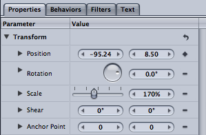
I then exported the project as a .mov file as this is the standard file format to use ready for others to view.
Tuesday, 1 December 2009
Batteries not Included - Motion Graphics
I really like this visual representation of the phrase created in After Effects. This shows perfectly how typography can be used to communicate the meaning of words, which is something that I need to aim to achieve in my work. I will look at ways in which I can use the type to communicate the meaning of the words.
That's My King! Typography Film
That's My King! from Albert Martin on Vimeo.
I like the way that the maker of this film has included some other graphics and also some video into the piece. The way that the video pieces freeze and become stylised graphics looks really effective. The video over all is stylised to look like an old scroll, communicating the fact that it is talking about biblical subjects, I want to stylise my video in a similar way using the sepia like tones and black text and graphics as I am wanting to communicate a similar thing.
Tick Tick Boom Motion Graphics
The maker of this Typography Motion Graphics short film uses the movement of the text to represent it's sound. For instance it blurs and snaps to place, representing the loud, almost shouting way that the singer sings. The camera is also rotated at the end of some of the song lines, showing the distinction between the lines. In my piece I will want to find ways to represent both the sound of the song and the words being sung through my graphics.
The creator of this piece has probably used either After Effects of Motion to create this piece. The text will have been created in the program and key frames used to animate it. The camera has also been animated using key frames to create movement and rotation. The items and camera are moved in the canvas and then a key frame added to create movement, the tweening is done automatically in the programs.
animation research
This is the music video for "Hey". The action follows the music and goes with the flow of the phrases within the music. Events such as crashing through floors etc coincide with a drum beat or certain guitar riffs.
The animation seems to have been produced via CGI, perhaps using a program such as Lightwave or Maya. It has more of a grungy feel then CGI can tend to, this has been achieved through texture and use of colour, rather then using bright, child like colours that CGI is often associated with in animation. I prefer this asI am not
I really like the grungy feel of this animation. It suits the style of music well. The use of textures and also cardboard as the material helps to achieve this.
All The Tears
Gojira | MySpace Music Videos
Although i generally like the actual animation of this piece I feel that it hasn't been edited to the music very well. The action of the animation should have been edited to the beat more to make it feel as though it is part of the music, it just doesn't really gel, they feel like two separate entities that just happen to have been placed together. In my piece I will make sure that I edit it to the music more professionally.
I really like the idea behind this, using everyday objects and giving them a different purpose and meaning. The message behind the animation is about western culture and what we value. The objects chosen work really well in this, and I feel that it is something that I would like to try doing.
I really like the idea of animating a human body as in this piece. It's experimental and different, which is what I would like to aim for in my piece. I also like the way that the frame rate is reduced, making it look like an animation (although slower) but still giving the feeling of motion. This is something that I could have a look at doing, or animating at a standard rate.
This animation actually gave me the idea to use barcodes to animate with. It lead to me putting together a narrative based on the idea of the beginning of the end of the world and trying to resist the mark of the beast.
Again this animation uses the human body to animate with. I like the fact that they have tried something different and turned the human body into a skateboard, seemingly achieving the impossible. The sound in this animation really enhances the action, it is realistic and changes in the right places i.e at jumps it sounds like the skate board has been lifted into the air and landed again.
Typography tutorials
http://ae.tutsplus.com/tutorials/motion-graphics/design-rhythmic-motion-typography-in-after-effects/
For my Digital Storytelling project I want to create typographical motion graphics short film. I found the tutorial above to help give me ideas. The movement in the graphics needs to represent some aspect of the sound or the story, for instance important words may be bigger and functional words (and, it etc) made smaller to represent their relative insignificance.
http://www.kenstone.net/fcp_homepage/motion_working_keyframes1_spencer.html
As after effects isn't available for me to use I have taught myself how to use Motion, part of the Final Cut Pro package. Although I have worked most things out how to create a key frame was not immediately apparent so I used the tutorial above to learn how to use them in the program.
Sunday, 22 November 2009
Old Poets

Ok so this is really just a test for mobile blogging as my new phone comes with the ability to post to Blogger. However this is a really cool pub in Ashover called The Old Poets Corner. If only i lived nearer I could come sit and do college work here.

 Posts
Posts